Centering element in CSS is regarded as complicated and confusing by beginner developers. This is to be expected as it is not possible to center element by defining only one CSS property. The arrival of flex has made centering somewhat easier, especially vertically centering.
This article will cover various techniques to center element in CSS horizontally. Make sure to check browser support when using some techniques.
Using margin auto
This technique is usually used to center top level block element (like <div>, <main>, <article>) that surrounds the main content.
HTML:
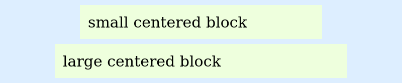
<div class="wrapper">
    <main class="centered-block">
        small centered block
    </main>
    <footer class="centered-block">
        large centered block
    </footer>
</div>
CSS:
.centered-block {
    margin-left: auto;
    margin-right: auto;
}

/* following styles are only for illustration */
.wrapper {
    max-width: 800px;
    background-color: #ddeeff;
    padding: 10px 0;
    font-size: 30px;
}
main {
    max-width: 450px;
}
footer {
    max-width: 550px;
    margin-top: 10px;
}
main, footer {
    background-color: #eeffdd;
    padding: 16px;
}
Result:
This technique requires following conditions are to be fulfilled:
- This has to be applied to the element to be centered (not the parent element).
- The element to be centered should have
displayCSS property set to one of the following values:block,flex,grid,table. Block-level elements like<div>,<p>,<form>,<body>implicitly havedisplay: blockstyling. Therefore, no styling is necessary unless the implicit styling is overridden. Inline elements like<span>,<button>require the style to be defined explicitly. - The
widthCSS property of the element should have value other than the defaultautoand the value should be less than the parent’s width. Setting width to either an absolute value (like 500px) or relative value (like 50%) can lead to problems like overflowing in small screen. So, to prevent that, you have to follow responsive design.
Some usage of this techniques are:
.containerclass in Bootstrap 4
Using text-align center
This technique is not only used to center text but also inline elements like <a>, <img>, <button>, etc.
HTML:
<div class="footer-links">
    <a href="#">Blog</a>
    <a href="#">FAQ</a>
    <a href="#">Jobs</a>
    <a href="#">About</a>
</div>
CSS:
.footer-links {
    text-align: center;
}

/* following styles are only for illustration */
.footer-links {
    max-width: 800px;
    background-color: #ddeeff;
    padding: 30px 0;
    font-size: 30px;
}
.footer-links a {
    padding: 8px;
    border: 1px solid;
}
Result:

This technique requires following conditions to be fulfilled:
- This has to be applied to the parent or ancestor of the element to be centered (not the element itself).
- The element to be centered should have
displayCSS property set to one of the following values:inline,inline-block,inline-table,inline-flex,inline-grid.
There are certain things to keep in mind when using text-align center technique:
- There will be space between the elements as the elements are inline and we need to use space to separate the elements.
Usage:
.text-centerclass in Bootstrap 4
Using Flex
Flex is a relatively new technique than the previous ones and also overcomes their limitation when aligning element horizontally.
HTML:
<div class="footer-links">
    <a href="#">Blog</a>
    <a href="#">FAQ</a>
    <a href="#">Jobs</a>
    <a href="#">About</a>
</div>
CSS:
.footer-links {
    display: flex;
    justify-content: center;
    flex-wrap: wrap;
}

/* following styles are only for illustration */
.footer-links {
    max-width: 800px;
    background-color: #ddeeff;
    padding: 30px 0;
    font-size: 30px;
}
.footer-links a {
    padding: 8px;
    border: 1px solid;
}
Result:

Note:
- Check support for flex in the targeted browser (https://caniuse.com/flexbox)